Thursday, 20 January 2011

Magazine Double Page Spread

The brief was to design three double page spreads for a typographic magazine, with a theme of typology, using an article on 'The theory of the derive'. I chose to do street signs as my typographic theme. 

Before i chose to do the street signs, i just went around Lincoln and took pictures of any type i saw to get an idea of what i could do, here are my contact sheets.


Then i re-did my photographs of just street signs...


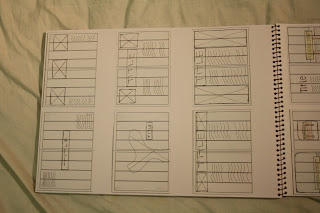
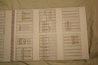
Few pages from my sketchpad...


And these are my final three double page spreads..
(click to enlarge)


Still awaiting grades for these, don't think i did toooo bad, could have been better though! Saying that, i do actually quite like them, a lot of space, and it looks neat and tidy, not like these 10 colour page messy spreads you see - eurgh!

Tuesday, 18 January 2011

Animation

This project is following the 5m drawing i did. I can't remember if i said before, but i did it wrong, it was too detailed, we had to do symbols, not pictures. So i re did it and made my animation on after effects, with a lot of help from Sunjay - thank you :D

This has got to be the worst project i have ever done.. I hate animation and i hated using after affects, i just couldn't get my head around it, but it was my first time so hopefully i'll get better :)

If you watch this please turn the volume down, the sound effects are so out of sync, it worked in after effects, but not when you save and play back, see this is why i hate it! Ha..


Awful i know! But i suppose you have to have work you hate as well as work you like! It is safe to say that i will not be going into animation after uni!