Our latest project is to create a zine, and we have to blog about our development instead of doing a sketchbook, not sure if I'm happy about that or not, i actually think my favourite part of a project is the sketchbook, but at least it will save time, paper, and ink!
Brief
Create a sustained graphic exposition based on the theme of your community, in particular the question: what does community mean?
Format
Zine between 16-32 pages including front and back cover. A minimum of 5 copies to be supplied, each copy to be numbered.
Restrictions
Output restricted to monotone laser photocopier, with provision for hand made embellishments of any colour and media. Any range of stocks and colours with sensitivity to cost and sustainability.
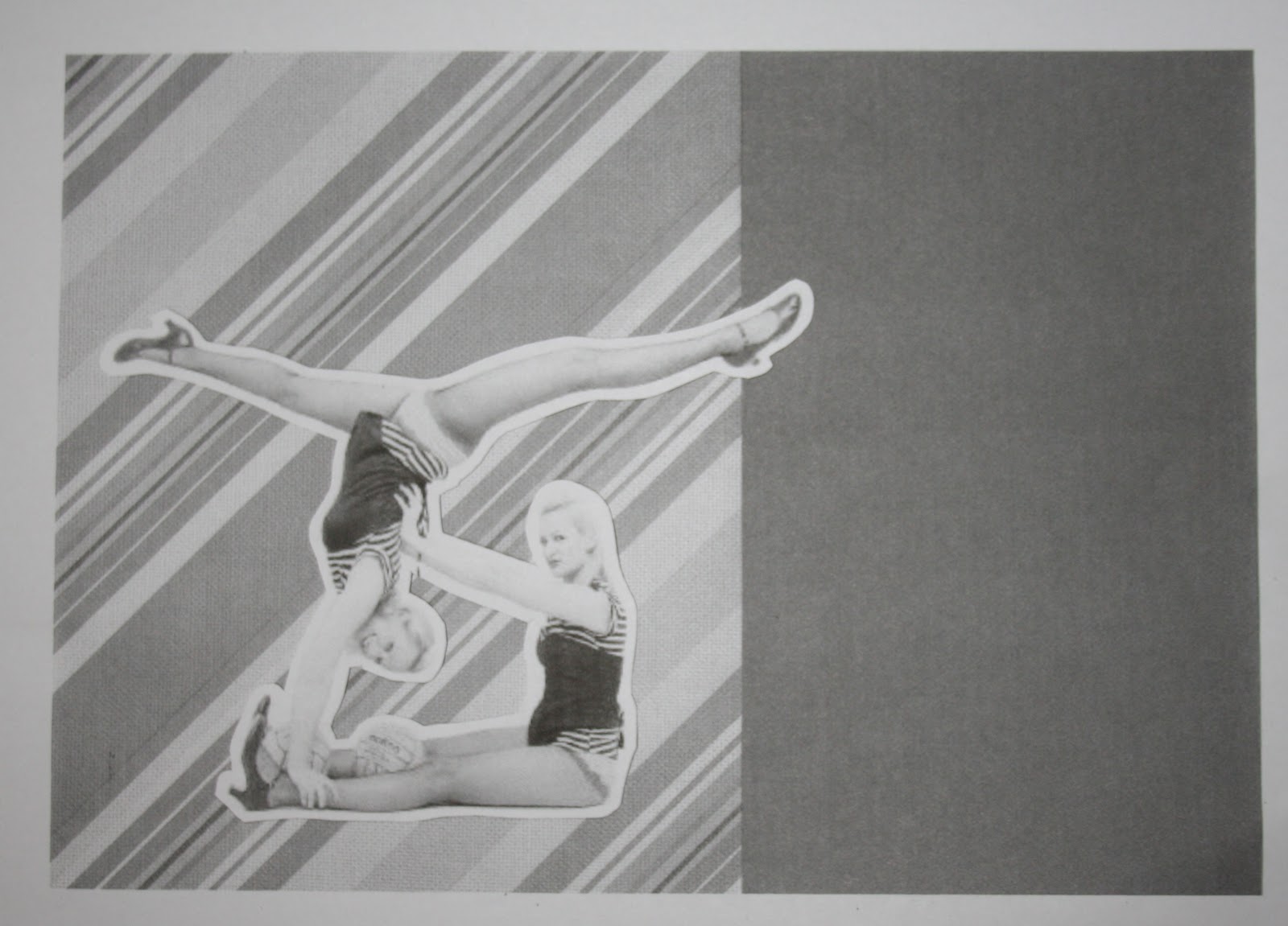
My Community
So this project is following the community project, which i haven't blogged about, but basically over the christmas holidays we had to think of a community and get as much info on it as possible, by interviewing members of that certain community. I chose to do dance (ballet, tap, modern, acro & musical theatre) based on a stage school in my home town. So my whole zine will be about dance, using the information i have from my research.
For more info go to their facebook page http://www.facebook.com/group.php?gid=2374352566
First of all I had to interview members of the school to gather research. I interviewed quite a few people but started to just get the same answers, so here i show the two main interviews i did at the beginning.
Interview Number 1
Does the community have a history?
- Open for 32 years
- 27 pantomimes
- 5 Mardi Gras (dance festival in London)
What commonalities and differences exist within the community?
- All students do the same type of dance
- Technicality and flexibility between each student is different
- Ages 3 – 80 (babes – adult tap)
- Different classes depending on age
- Only a handful of boys, mainly girls
Is it possible to adopt or become part of the community for a short time?
- Join as a hobby, or to gain experience
- Can join to take exams
- A gentleman came for 5 weeks to gain tap experience to achieve a part in a show, and succeeded.
Explain the relationships between community members
- Bitchiness, always competing for auditions and grading
- Support, even though you want to do better, you don’t want others to do bad
- Friendship bonds
- Socialize
Are there any community traditions?
- After show get togethers
- Pantos, 10 shows a year
- Take one exam a year
What challenges, struggles and issues are faced in the community?
- Trying to pick up steps
- Commitment, students tend to give up a lot
- General learning
What opportunities exist within the community and what does the future hold?
- Mardi Gras auditions
- Include own chorography
- Go to stage school
- Audition for professional shows
- Teaches strict discipline and punctuality
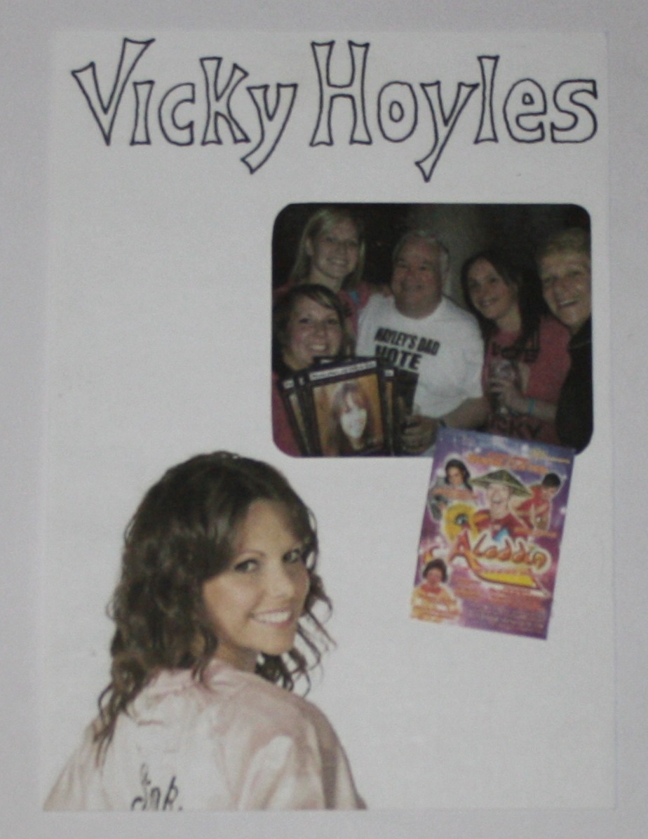
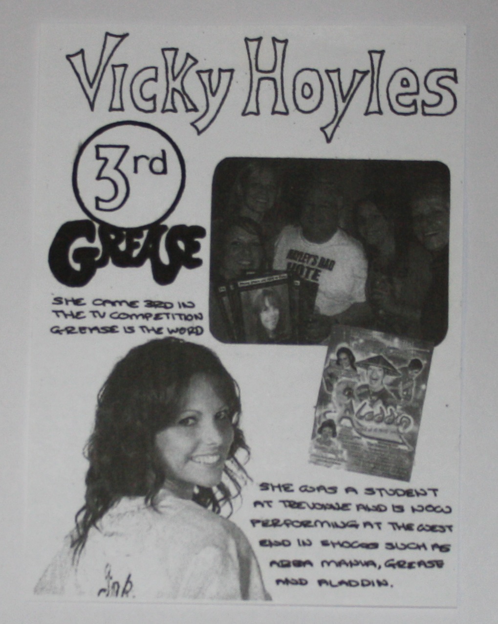
- A student, Vicky Hoyles came 3rd in the TV show Grease is the word, and now performs at the west end in plays such as Abba Mania and Aladdin
- A student, now teacher, Rachel Makins came in the top 50 in pop idol, and now has a record deal signed by Motown Legend, Edwin Starr
- 5 people have gone on to top stage schools in the country
How do you live and interact within the community?
- Go four times a week, the more classes you do, the more sessions you attend
Interview Number 2
Does the community have a history?
- Started in the 80’s
- Opened by Trevor and Yvonne (Trevonne)
- Daughter Hayley has now taken over the school
What commonalities and differences exist within the community?
- Panto every year
- Exams in summer
- Mardi Gras at Royal Albert Hall
Is it possible to adopt or become part of the community for a short time?
- Join and leave as you wish
- Pay as you go, £3 per session
Explain the relationships between community members
- Really laid back
- Friends outside of dancing, even with teachers
- Rounders team
- Race for life
Are there any community traditions?
- Panto every Christmas
- Party in dressing room after shows
- Secret Santa every year
-
What challenges, struggles and issues are faced in the community?
- Exams, but you do them when you feel ready
What opportunities exist within the community and what does the future hold?
- Grades from exams can count as ucas points
- Become a teacher
- Job in the costume shop
- One of the girls went to stage school and is now a professional street dancer
How do you live and interact within the community?
- I’ve done it since it since I was little so it has always been a part of my life.


Photographs


1000 word essay on the community


^
Click to enlarge to read the essay, the original one i typed was lost (read the last post to see reason) but luckily i printed out a copy, and i highlighted the important bits to put in my zine.
What is a zine?

Zine Research


Binding Research


^
I really like this binding, but it won't work on my zines as they will be too thin, looks neat and professional which i like.


^
I think this works really well, for a thick or thin booklet, and i wouldn't mind giving it a go on my zine!

Thumbnails

^
I like the bottom right one, with the ripped up paper, polaroid photograph and paperclip, it looks like it's a zine, it's not as neat and organized as the others.


^
Could have either photographed the ballet shoes I have from my research, or drawn them.


^
Love the idea of this, it's made to look like ribbon forming the letters, i could either draw this like above, or make it from ribbon and photograph it.


Development
Cover

^
Made this collage style cover by using cardboard as the background, on the left is a strip of mesh material, with ribbon on top, and a bow. I printed out a photograph and cut off the corners to get rounded edges, then stuck in on paper, and added a paperclip for an extra effect. I wrote the title on masking tape, in 3D writing, i also wrote the issue number on masking tape, and used paper and marker pen for the price.

^
I really like the textures of the cover, i think all of this will be lost when photocopied.

^
It doesn't look half as good after being photocopied, i had the idea of using actual ribbon on the front covers, or stick a real bow on, instead of just having a photo I might try this at the end.

This is my final zine cover, in colour, on the back i used a photograph i took of a student in a costume.
Page One

^
A photo of a ballerina I came across on www.sxc.hu

^
Used the font Impact here, and edited the letters in illustrator to make them closer together. I then flipped the ballerina image from above to fit in with the text.
Page Two

^
I made this using marble paper and a page ripped from my sketchbook, then scanned it in.

^
Added the text, and three photographs. Now i will print this out and photocopy it, I'm worried it isn't going to look very good black and white.

^
Printed the layout out in colour and did some doodles on top to see if anything works well before i do it on the final one. I like the microphone hanging, and the musical notes, and i think i like the outline around the notepad too, although it loses the effect of the ripped paper.

^
Drew the microphone and musical notes

^
Added the black outline inside the holes on the left of the ripped paper.

^
Decided to go with the outline around the ripped paper.

^
Outline around the marble paper.

^
This is the final page, it doesn't look half as good in black and white, the marble effect has almost gone, and the pictures aren't very clear at all.
Page Three
^
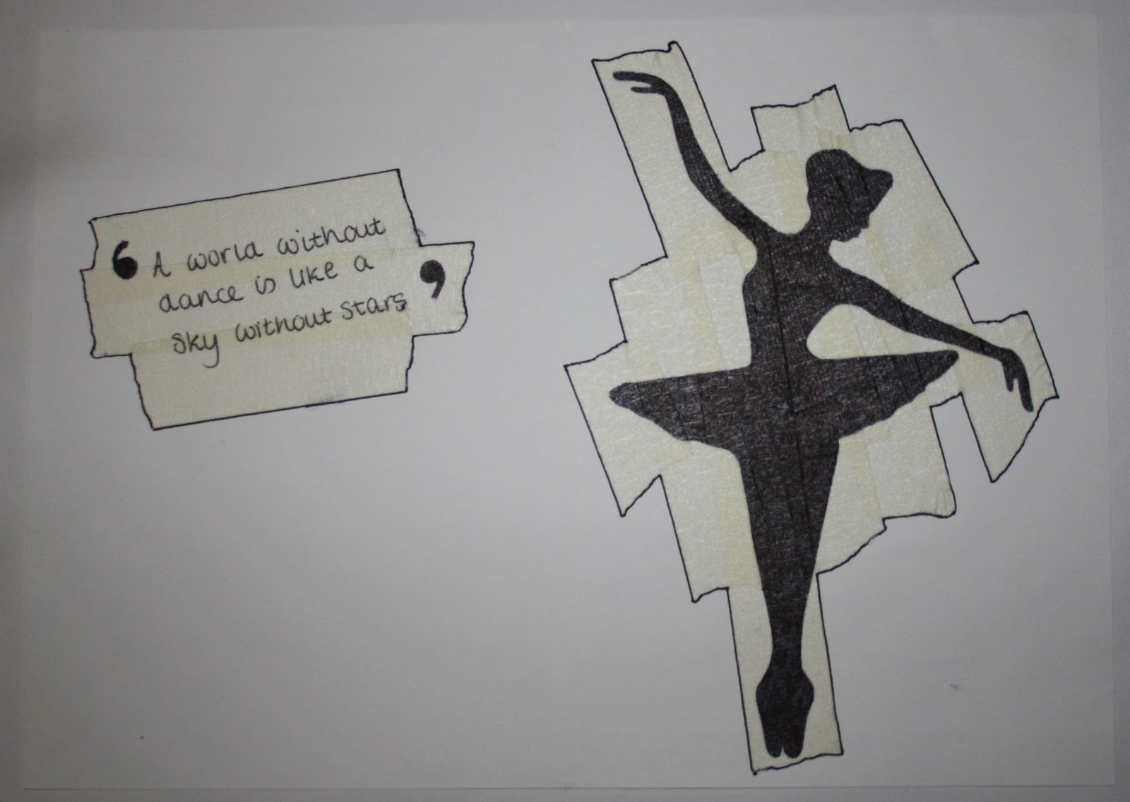
I stuck loads of masking tape down and wrote and drew on top of it. I used a quote from a student i interviewed. I love the effect the original gives, but I'm not sure it will look as good photocopied.

^
This is a photo i downloaded from www.sxc.hu, a silhouette of a ballerina. I traced this onto this page.

^
What it looks like photocopied, it's lost it's effect of the masking tape, you can still see it slightly, maybe it would look good printed on coloured paper?

^
Photocopied on pink paper, i chose pink to match the ballerina theme. I prefer the paper colour, but it loses the masking tape effect even more.

^
Photocopied on yellow paper, i chose yellow as it's a 'pretty' colour, and thought it went well with the ballerina theme. I like the yellow background, but just like the pink paper, it loses the masking tape effect even more than the white paper does.

^
This is the final page, i don't like how it turned out this is nothing compare to the texture and effect the original had. I'm quite disappointed. I could always stick masking tape on the finals, but it would be hard work doing it exactly the same on each zine.
Page Four

^
I made this using blue crete paper for the background, and ripped up card for the corners, then masking tape for the title, written on in black fine liner. This looks good as it is, but i'm worried it will look too dull when photocopied because of the dark blue. I will now scan this in for editing.

^
After scanning the collage in, i made some polaroids with photos in of students in their costumes, like the polaroid idea but they look a bit odd just sat there.

^
What it looks like photocopied, like i thought, looks too dark!

^
Added a line and pegs, so they polaroids weren't just floating, they looked a bit odd before,

^
This is the final page. I wrote the important facts on paper, cut out with zigzag scissors and stuck on. Don't like the finished page, looked very dull, would look so much better with the original colour and texture, you lose a lot when you photocopy.
Page Five

^
This was the first layout i did on illustrator.

^
After printing it out i decided i wanted to change it, so i just cut the photos out, and stuck them on pink paper, and wrote students in bubble writing, instead of using an illustrator font.

^
Trying to find a writing style to fit the paragraph in

^
I like this style of writing, all upper case, but as you can see, it didn't fit

^
Did the writing smaller to make sure it fits. Then started to do the bubble writing at the bottom, in pencil first, and over the top with black fine liner

^
Showing how the bubble writing will look, making sure it works before i do the paragraph of writing

Here i gave the bubble writing a shadow to make it look 3D, and i quickly wrote some words to see if it would look good when the text was there, i really like the 3D look

^
Back to the original, i wrote the paragraph in, and luckily it just fit.

^
And finally, here is the finished page, the photocopying made the pictures very hard to see, but i like the bubble writing. That is the only part that works well in black and white.
Page Six

^
Top Left - Quick thumbnail of how i want my page to look, i thought i'd go for a more cartoon style, illustrated page here. Also tested how i should have the hair on the stick men.
Top Middle - Drawn the thumbnail up neat here.
Top Right - Coloured the skirts in black.
Bottom Left - A quick thumbnail of how i want the right side of the page to look.
Bottom Right - Another quick thumbnail of how i want the right page to look, in a bit more detail.

^
Printed off a photograph of the Trevonne students doing last years race for life. Also printed out the breast cancer logo to stick with the photo, just to give an idea of what the race is for to people who may not know.

^
Photocopied the above in black and white

^
Added some writing on the page, about how they interact socially

^
Added a rough border around the photograph

^
Added a rough outline around the breast cancer logo and the santa hat too

^
Went back to just a border around the photograph, and sketched the hat in black pen

^
Neatly coloured the hat in with pencil

^
Made the line on the hat a bit more sketchier, and added the line around the breast cancer logo again

^
This is the final page, the things changed is the coloured in 3D look on the 500 students, and the coloured in black skirts. I think maybe this page could have had a bit of colour added, but i do really like it, how its almost all done by hand.
Page Seven

^
Quick thumbnail of how i want the page to look
^
Printed these three photos out, stuck them like this so i can draw and write around them.

^
Photocopied the above to see what it would look like black and white, and straight away, it is dark, and the photo's aren't very clear anymore

^
Did some doodles and text here, and wrote some text in pencil just to make sure it fits before i use pen on my final one
^
Added all of the writing and doodles here, but it still looks a bit too plain i think

^
Started on the second page here, did a similar layout to the left page with the photo with text next to it, and the two drawings of what they are famous for. Also filled the titles in with black pen.

^
Finished the right page now, added another drawing and some more text.

^
This is the final page, i like how it is two separate pages, but it almost looks like the same page because the layout is very similar, just changed slightly. I think this page does work well in black and white, but the photo's aren't very clear after photocopying which is a shame.
Page Eight

^
Made the title from cut out letters from magazines

^
Started to add some text

^
Added more text, it's starting to come together now

^
Finished all of the writing here, it's all different ways, but it still needs separating more i think

^
Added a black outline around each box, much clearer now, and stands out more too

^
Drawn on a line above the title here, looks odd on it's own so i'll try one underneith too

I like it with boxes around the letters, this way it matches the rest of the text in boxes on the page

^
Here i added a photo in the circle on the original one, just to finish it off

^
Photocopied with the photo

^
This is the final page, i think this page works in black and white, although it was quite colourful at the start, it photocopied well, it looks quite crowed, and full of text, but when separated in boxes it makes it look easier to read.
Page Nine

^
This is what i put together on illustrator, ready to print off and write around

^
Printed, and photocopied in black and white, the photographs on the right aren't very clear anymore

^
Here it is with writing on each page, i also added some rough borders around both pictures on the right, and some lines around the pictures on the left, i think the left ones look okay, but i don't like the right ones at all, they look too messy

This is the final page. I decided to not use any lines at all, so it looks cleaner and neater, i think this page would have worked a lot better in colour as the photo's can hardly be made out now
Page Ten


^
The left image of the pink spotty pattern was some paper i scanned in, and the image of the ballerina on the right i came across on www.sxc.hu

^
First of all i printed the ballerina picture out, and stuck it on top of the two different papers

^
Then i photocopied it to see if it works in black and white, it looks so much better in colour, but it's still fairly clear to see

^
I scanned the colour collage back in, and added a small paragraph about ballet, using illustrator

^
I then printed it off in black and white, and drew the word ballet in the style as if it had been done with ribbon

^
Then i gave the ballerina photograph a black outline, but i think it looks a bit odd as you can't really see the actual picture very well

^
On this layout i also gave an outline to the actual photograph as well as the border, and this is a lot better.

^
Here i stitched some cotton into the top of the paper, just for an added effect in the empty space

This is the final page. I think it works really well how it all fits together, but i hate it in black and white, it ruins it as i think it could have been so much better in colour
Page Eleven


^
The left image is a vector pattern i downloaded from www.sxc.hu for the border, i also got this dance image from www.sxc.hu too.

^
First of all i cut the people out and re stuck them down, so they had a border, and wrote the word Modern

^
I scanned the above image in, and added the paragraph about modern dance in illustrator

^
After printing it out in black and white, i drew a border around the two people, but just like the ballet one, it looks odd with just the outer outline drawn on, so i'll do the inside one too

^
This is my final page, i finished it off by doing another outline around the people. I don't like this in black and white at all, the vector patterns don't look very good as they should be bright and colourful, and the people look really dull and are hard to make out.
Page Twelve

^
This is the image i downloaded from www.sxc.hu of a tap dancer, that i will use on my page

^
I used some striped paper and pink foam for the background, then cut the tap dancer out and stuck her on the page with a border

^
I photocopied the above, and wrote tap on the page in 3D writing, i also drew around the tap dancer in black pen like i have done the past few pages

^
I then scanned the above in, and added a paragraph about tap dancing using illustrator. This is my final page, I don't like the page in black and white, i really liked the colourful background, and now it looks really dull.
Page Thirteen

^
Here is an image of acro performers i downloaded from www.sxc.hu, i will be using this on my page
^
Using coloured striped card and pink paper i made the background, see below, and cut the acro performers out with a border and stuck in on top. This is it photocopied, the background doesn't look as bad as i thought it would in black and white

^
Instead of drawing on the black and white page, i decided to do it straight onto the original so it photocopies better. I wrote Acro in black pen, with a slight shadow for effect, it looks a lot better in colour.

^
After scanning the above in, i added a small paragraph about acro using illustrator

^
This is my final page, i finished it off by adding a double outline around the acro performers, to match the previous layouts. I didn't mind it in black and white before, but now i have photocopied it once more, the photograph has faded and it's hard to make out.
Page Fourteen

^
Here is the image of a woman singing into a microphone i downloaded from www.sxc.hu, to use on my musical theatre page.

^
Here i got some green ripped paper for half of the page, and cut the woman singing out and stuck it on the paper. I then wrote musical theatre in black pen using musical notes as letters, to match the theme

^
I then scanned the collage in, and added a small paragraph about musical theatre using illustrator

^
Then i printed it out in black and white, it looks really dull, but still works okay i think

^
This is my final page for musical theatre, i finished it off by doing a double outline on the woman singing to match the other pages. I think this is the best one that works in black and white, because the image hasn't faded as much as the rest.
Page Fifteen

^
This is the original page i did on illustrator, i really like the layout of the ampersand bigger behind the text. Not sure it will look very good when photocopied though, might blend in too much and look messy

^
Here i photocopied it, and it looks better than i though, you can still make out that it is a separate letter. I also added a staple in the photograph for an extra effect, but it isn't very noticeable.

^
Thought i'd try the staple thing again, but add one each side, they're hardly noticeable, don't really like this idea as much now

^
Instead of the staple idea, i tried a paperclip, and this works a lot better

^
Started to add some text, title in big bold lettering, and messy, but readable handwriting for the paragraph

^
Added some more at the bottom here to fill the page, i think it looks a bit empty still though

This is my final page, all i did to finish off was colour the parts on the title in, to make it look bolder and more 3D. I think this page works well in black and white, the picture would look good in colour, but it is still visible when photocopied, unlike some of the other photographs in the zine.
Mock Up Zine


^
Here i've just stuck the pages together quickly using double sided sticky tape, just to show the order of the pages, so i can fit them together to print. Although this is the rough version, i think it looks alright when put together.
Final Zines
PROBLEM!!!!
So, the day of my review, and i've just put all of my work onto my hard drive to go to the library to print properly, and what happened, somehowwww the transfer wiped my hard drive. I have no work to show for this project other than what i have already put on here, and the mock up. Not to mention all the other work i lost that was on it! I'm soooo annoyed, i have my review in a few hours and i have nothing to show for it! There's no way i will re make them all on time now, looks like i will have to take this crappy little mock up with me and hope i don't fail! I would be gutted! I'm just glad i printed it out to prove i actually did it! Grrrrrrrrrrr!!!!!
Anyway, i'm going to go to my review with the mock up, and ask if i can still make the zines to hand in, if they say no, i'll probably still make them anyway, just to finish the project for myself really, would be good to see them made up properly! Wish me luck!